In the screen printing induction session we learnt how to prepare screens from our own designs and produced a range of samples to test them out and to become familiar with working in the 2D workshop. I have prepared my own screens using a variety of methods, but had no knowledge of the photographic method using the Graffiscreen/Printascreen.
I had used screen-printing inks before, but usually prefer dye paste as it maintains the handle of the fabric, giving a softer feel for manipulating into folds, pleats etc. As the demo was with printing inks, we used them for our samples and I was quite pleased with the results. My screen designs had a measure of the vitality I was aiming for, and I experimented with layering up the image in different values, overlaying images from the two screens and printing on a range of fabrics, including calico, sikco, cotton organdie, and sheer nylon curtain fabric.
 Calico
- top section was a by-product of printing on the sheer nylon curtain fabric laid over the calico. The image was clear and sharp on the nylon, and had a faded look where it printed through onto the calico.
- bottom section – blank screen with areas masked off (red), overprinted with second screen in black (negative image).
This was interesting as a sample and could be worked on further, although I can’t visualise it working as a coherent piece. The contast of the straight lines on the red, with the vitality of the black overlapping prints at the bottom, produced some vey interesting patterns and shading.
 Silkco
- Positive image (1st screen) – script-like marks and ink blots. This image does not show the clear, white fabric well, but the sample had a crisp, fresh feel to it and I like the energy in the marks.
 Silkco overlaid with nylon
- Overlaying gives more scope for creating a range of tonal values and combining the marks to give a more complex pattern. Unfortunately, the nylon sample was smaller than the silkco and limited the scope for exploring layering.
 Black cotton organdie
- The first print was done using the negative image screen and red medium, as that was left over from the demo. It was not at all successful, as the dark red didn’t show up well enough on the black fabric, although it did interrupt the surface.
- As there was nothing to lose, I overprinted it with the same image in white. When dry, it gave a very slight hint of pink that worked well with the black fabric.
- I then overprinted it with the positive image screen in black and white.
There are some interesting effects on this sample, that I would definitely like to explore further – the overlapping marks created a range of tonal values and the black on black print resulted in a shading which was particularly interesting on the transparent fabric.
The samples came alive when pinned onto the white wall in the studio.


I think they may be worth developing further, perhaps with more printing, piecing or stitch, and could be hung together.
The calico could be cut into four pieces, with each being developed in a different way.
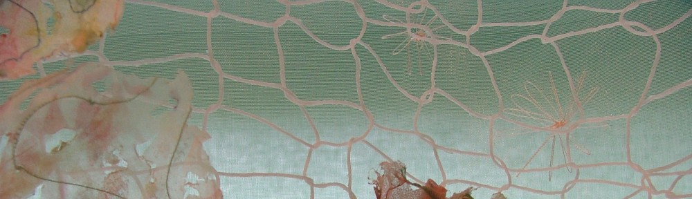
I also tried displaying the paper-laminated sheer fabric against the white studio wall. It had been intended to hang against a window, but somehow didn’t work well there, but it took on new life against the white background. Again, this is worth developing. A commercially-supplied screen was used for this sample, but I intend to try the technique using my own screens, to make it more relevant to my topic.

