Printing Part 2

I tried layering up one of the printed samples at home, by writing with a needle-nose bottle.


Not as satisfying as working with dye paste.  I prefer to layer up a design using dyes, and keep printing inks as a final layer if necessary.

I worked back into the sample with more inks, applied with a bottle, large brush and scraper.  The colours should become more vibrant when heat set, but the sample already looks more powerful.  I still don’t like the quality of printing inks on fabric, but the varied quality of the marks, scale and direction gives it more energy.

Photographing detailed sections also opened up more possibilities for composition.

Worth trying this with dye paints, starting with a print with the same screen, then painting and layering with the same tools in a similar colour range.

I plan to dye paint a whole length of fabric in this way, as an experiment.  It might be worked back into, cut and reassembled, or manipulated into pleats and reprinted.

Screen Printing

In the screen printing induction session we learnt how to prepare screens from our own designs and produced a range of samples to test them out and to become familiar with working in the 2D workshop.  I have prepared my own screens using a variety of methods, but had no knowledge of the photographic method using the Graffiscreen/Printascreen.

I had used screen-printing inks before, but usually prefer dye paste as it maintains the handle of the fabric, giving a softer feel for manipulating into folds, pleats etc.  As the demo was with printing inks, we used them for our samples and I was quite pleased with the results.  My screen designs had a measure of the vitality I was aiming for, and I experimented with layering up the image in different values, overlaying images from the two screens and printing on a range of fabrics, including calico, sikco, cotton organdie, and sheer nylon curtain fabric.

Calico

  • top section was a by-product of printing on the sheer nylon curtain fabric laid over the calico.  The image was clear and sharp on the nylon, and had a faded look where it printed through onto the calico.
  • bottom section – blank screen with areas masked off (red), overprinted with second screen in black (negative image).

This was interesting as a sample and could be worked on further, although I can’t visualise it working as a coherent piece.  The contast of the straight lines on the red, with the vitality of the black overlapping prints at the bottom, produced some vey interesting patterns and shading.

Silkco

  • Positive image (1st screen) – script-like marks and ink blots.  This image does not show the clear, white fabric well, but the sample had a crisp, fresh feel to it and I like the energy in the marks.

Silkco overlaid with nylon

  • Overlaying gives more scope for creating a range of tonal values and combining the marks to give a more complex pattern.  Unfortunately, the nylon sample was smaller than the silkco and limited the scope for exploring layering.

Black cotton organdie

  • The first print was done using the negative image screen and red medium, as that was left over from the demo.  It was not at all successful, as the dark red didn’t show up well enough on the black fabric, although it did interrupt the surface.
  • As there was nothing to lose, I overprinted it with the same image in white.  When dry, it gave a very slight hint of pink that worked well with the black fabric.
  • I then overprinted it with the positive image screen in black and white.

There are some interesting effects on this sample, that I would definitely like to explore further – the overlapping marks created a range of tonal values and the black on black print resulted in a shading which was particularly interesting on the transparent fabric.

The samples came alive when pinned onto the white wall in the studio.

I think they may be worth developing further, perhaps with more printing, piecing or stitch, and could be hung together.

The calico could be cut into four pieces, with each being developed in a different way.

I also tried displaying the paper-laminated sheer fabric against the white studio wall.  It had been intended to hang against a window, but somehow didn’t work well there, but it took on new life against the white background.  Again, this is worth developing.  A commercially-supplied screen was used for this sample, but I intend to try the technique using my own screens, to make it more relevant to my topic.

Validating Research

Looking back at how my ideas and practice have developed over the past couple of months while writing this blog, I can see that my thinking is not random.  I do consider a range of varied ideas, but reject those with no link to my main concept. One idea is linked to another and each is inspired by my research.  Exhibitions visited, my reading, and feedback from tutors and other students feeds into this and contributes to form the basis of a series of explorations towards refining and expressing my concept.  A range of different textile processes are available to be used separately or in combination and I think it is appropriate to ‘cast the net widely’ at this early stage – both in terms of elements to research and processes.

I think I will need to be more rigorous in planning, testing and recording certain technical processes as my project progresses, but only when this advances my research.  For example, it would be useful to test the effectiveness of a range of methods for curing dye-painted fabric, so that the quality of samples can be improved.  I’m not sure that it would be useful to work through the colour ranges though.  At this point, I am still considering other processes, so technical trials will be more relevant later.

Cogs, links and threads

I am aware that ideas are processing in the back of my mind most of the time, even when I’m not working.  The cogs were turning after writing yesterday’s post and I remembered some work I did some time ago that seems to link with my recent samples; the first in terms of the materials used and the second with regard to content.

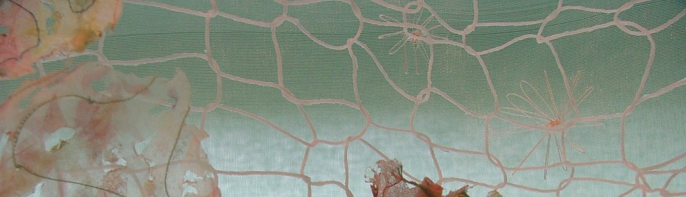
This was a layered hanging, with a sheer, hand-embroidered back layer and a stiffened, knitted network with moulded, cup-like forms suspended on it.  The use of heat to shape the synthetic fabric, the process of distressing with a soldering iron, the layering and the network could inform work around the idea of multilayered dialogue and meaning.  Perhaps I could also play with the idea of transparency, complexity and opacity in communication.

The second set of samples had been worked around the idea of graffiti. The work was inspired by a visit to Prague where I took many photographs of the colourful wall layered in graffiti as a tribute to John Lennon.  The original portrait of him was layered over with contributions from many different people. Visitors of various nationalities had added their names, dates, comments about the artist, political messages, or images. After the initial attraction and excitement of the bright colours, it was interesting to look more closely at the layers of writing and try to decipher the contributions of the many people who had added to the graffiti.  Although the composition was completely random it was interesting to work from the photographs and isolate sections of it to reproduce in textiles.

This sample was constructed from handmade paper, layered and peeled back, painted, machine embroidered, hand embroidered and finished with acrylic wax.

Hand-dyed cotton with insertion stitch, hand and machine embroidery.

Painted calico and machine-embroidered scrim, printed, embossed and hand-pieced.

A selection of the original photos:-

On a visit to Grayson Perry’s recent exhibition “The Tomb of the Unknown Craftsman” at the British Museum. The exhibits I was most drawn to were the superb pots showing figures and comments on everyday life.  They were highly crafted, but, in the manner of graffiti, some had layers of overlapping images and text, so that there was always something new to discover. The blue vase is entitled “Boring People”, and the yellow and blue The Rosetta Vase”. Figures are depicted alongside text captions, sometimes framed and at other times appearing in speech bubbles. This reminds me of artist Tilleke Schwartz, whose work I admire and which also includes contemporary personal and social commentary and has a similar energy to the work of Grayson Perry but in a different media -.art textiles. (Examples below)

Could it be that I have found my thread? Having come back around to elements that interested me a long time ago, I can see that perhaps choices I’ve made haven’t been as arbitrary as they seemed.  Could the cogs be turning to find links and threads that reveal the connections I need to find a way to express my own significant ideas in a textile work that is also meaningful for others?

Graffiti is often a chance mixture of contributions from a range of people – jotting down or recording something that seems important to them at a certain time and place. Graffiti is layered – you often have to look carefully to decipher it and sometimes it is impossible to read. It can be meaningful or meaningless. It can be a declaration or a decoration or tribute. All of this applies to the ‘John Lennon wall’ in Prague,although it is not coherent as a work of art. Perhaps I could use this form to express my own thoughts and feelings about significant events or people in my life, without baring my soul. Whilst the artists work shown here features surface design, I might be able to combine this with a textured element to further disguise the content. Although each of us has our unique, personal experience of life, there is often a common element which strikes a chord.  Glimpses of my own experience may resonate with offers when applied to their own experiences.

Perhaps I have found my thread!

Perhaps the form of my work needs to function as a metaphor for what Marsha Wineman calls “the space between communication and understanding”, and within that framework I can have my own space to use personal text or to make it universal.

Fragmenting the text

For some time I have preferred to work with natural fabrics like silk, cotton, or a mix of both, and have recently used procion dyes for painting and printing, but synthetic fabrics offer some alternative options for colouring, manipulating and distressing  textiles.   I therefore thought it would be interesting to explore ways of disguising the text using these processes with synthetics.  They don’t take procion or acid dyes, so have to be coloured with fabric paints, acrylics, or transfer paints.  They can be shaped by steaming or using a heatpress.  The first stage of this sample was to apply a paper-laminated grid to the sheer fabric, using a silkscreen.

The sample was then roughly crumpled, and pressed with an iron to form random pleats.  Script was applied across these using fabric paints.

More script was added with permanent marker, again applied across the folds.

Script was then burnt into the fabric using a soldering iron.

When stretched out, the script fragmented.

Evaluation:-  The pleats would be more crisp if pressed in a heatpress, or set in a steamer, and the fabric paint was too thin, resulting in spreading to create a thicker line than I wanted.  I need to find a way of thickening the paint………….With dyes I would use  Manutex, but would it work with fabric paints?  Acrylic paint would be thicker, but would alter the handling of the fabric.  I was dissatisfied with the heavy-handed quality of the painted script, and the colours weren’t as clear as I had hoped.  They might be sharper if heat set.  Worth developing this technique further, as the materials could be suitable for three-dimensional work, possibly steam set around a former.

Codes

Having decided to shelve the idea of rhythm, pattern, dance, textile design etc from the last blog, ideas around it still keep popping into my head. I’ve been considering exploring my ideas in colour in a more formulaic way – wondering how it might work to have a simple code e.g. each letter or digraph corresponding to a different colour. The idea may have come from a recent visit to the Gerhard Richter exhibition at the Tate Modern where I saw his abstract paintings of colour charts which were composed of a number of regular squares, each painted in a different colour.  He explains his methodology in the ‘Quotes’ section of the website http://www.gerhard-richter.com

Gerhard Richter, '192 colours'

Gerhard Richter, '25 colours'

My code might work like this:-

  • The first stage might be to allocate the three primary colours to three of the vowels, then allocate the secondary colours and so on.
  • The next stage might be translating some words into colour – e.g. the word ‘step’ or ‘tread’ – how does the pattern look? does it work? does it jar?
  • Could also have a symbol to correspond with a letter.
  • I could try translating some of my previous pieces using this code, and explore a combination of different media.  Perhaps handmade paper with fabric or string.

Need to investigate this in my sketchbook before going off on yet another tangent.  I can become so involved in the ideas stage that I have difficulty in filtering them so that I can move forward.  I’m quite good at moving sideways in different directions, which is fascinating and great fun, but gets in the way of completing a piece of work.

The blog is working well as a place to record and develop ideas, but I think I should review and analyse it so that I can isolate ideas and try them out in practice.

A Diversion?

Looking back at the last blog entry, I think I’m beginning to go off track with the dancing/music/rhythm thing.  I might come back to it, but for now need to re-focus on my main ideas.  I need to do much more research around memory, language and communication, different language and script styles etc, possibly look at manuscripts in the British Library.

I’ve been reading about the work of Sylvia Ptak and Celeste Scopelites, Canadian textile artists whose work (examples pictured below) appeared in an exhibition entitled ‘Sotto Voce’.  The curator, Marsha Wineman, refers to their examination of “the quiet spaces between communication and comprehension.”  This resonates with me as I think that often space is not given to thinking time in conversation.  Often the opinions of the gregarious, vocal individual are given more credence, largely because they are said with great self assurance.  Each of us processes thoughts at a different speed, but often, in conversation, those who need more thinking time might miss their opportunity to participate in a dialogue.  Also, thinking about a recent experience of trying to communicate with a bank via a call centre – the person answering my call introduced himself very politely, but spoke so rapidly I had no idea what he had said.  He might have been speaking in another language. What is the point of speaking if you aren’t communicating? This links back to my interest in the effectiveness of spoken language as communication, and what happens when it breaks down.  Another quote from Marsha Wineman seems relevant here:- “language as something more than a transparent medium of communication.”  This is the bit that really interests me, I think, and makes me realise that I probably need to delve deeper into my original interests before diverting into other areas.

(I was slightly disheartened to find that Sylvia Ptak’s work shows that she has, for some time, been using techniques that I thought I had ‘discovered’ recently!)

Music? Dance?

Heard a reference on the radio yesterday to a South African singer of the 1930’s, called Al Bowlly.  This links with my interest in personal stories as part of social history – events that could only have happened in a certain context.  My Dad used to play lead trumpet in a dance band and music is still his main interest.  I recalled him talking about this singer and saying that he was the first real ‘pop’ singer.  He sang songs that are still well known today, like ‘The Very Thought of You’.   Dad told me his story today – one of a short life of fame with a tragic ending.  At the height of his career he was singing at a West End club with a West Indian band led by someone called ‘Snake-Hips’ Johnson (?!).  When an air raid began, Al Bowlly left the club and returned to his flat.  Tragically, he was killed in an air raid, and the band were wiped out in a direct hit on the club where they were playing.  One of many corpses to be dealt with at that time, Bowlly was initially unidentified and was buried in a paupers’ grave in West London.  How are the mighty fallen!!!!

While driving home, I began to think about noting the story in my blog, at the same time questioning its relevance.  Why is it important to me that I record this? – it was before my time and in one sense totally irrelevant.  I decided that it links back to an earlier blog entry about wanting to preserve an element of an important person, time or element in my life. The story connected with me through my Dad’s interest in music. Music and dance have always been important to me.  I remember:-

  • Going to the park on a Sunday afternoon to watch Dad play lead trumpet in the band and feeling so proud when he stood up to do his solo.
  • There was always music on the ‘wireless’ at home – Mum used to sing along, even though she was tone deaf!  Consequently, I know the words to many of the old standards, even though they were around before I was born.
  • Performing in the annual dance display at the Rudolph Steiner theatre in London – ‘Gladys Harmer’s Stars of the Future’!  ‘Miss’ Harmer was a former ‘Tiller Girl’.

Thinking around all this links back also to the fascination with how events and situations relate to a certain point in time.  With this story and thoughts about dance and music, certain things speak of the times I grew up in – elements now consigned to social history, and largely arguably irrelevant today.  Interesting to me, though, as history is made up of the lives of ordinary people as well as the great and the good:-

  • Bandstands in the park
  • Saturday night dances at Wembley Town Hall ( Dad used to play there – Mum loved dancing and was very good at it, but without a partner, all she could do was sit on the side of the stage doing her knitting, or, after having children, spend every Saturday night at home alone.  Another example of different versions of reality about the same event.)
  • Then the demise of the dance bands, as ‘pop groups’ took over.  The history of popular music is fascinating, as, again, I can hook it onto my own experience.
  • Also dance troupes like the Tiller Girls – particular to that time, though, I guess, still around now in variety shows to some extent.

So, I suppose all this has some relevance to threads I’ve been considering – social history, personal stories, different realities, wanting to preserve an element of something or someone important.

Another thought occurred to me whilst driving home, listening to Little Richard’s rock ‘n’ Roll song ‘Good Golly Miss Molly’  (tricky trying to jive while driving) –  could I translate the excitement of music and dance into textiles?  Not thinking of simply using bright, exhuberant colours to represent eg rock n roll, but more along the lines of:- rock n roll > rhythm / beat > dance> steps > pattern > colour.  I don’t know enough about the technicalities of music to know if this is feasible yet, but I’m sure there are artists who have worked with this in some way.  Worth researching.

Development ideas

Some ideas following on from recent explorations:-

  • The samples so far have been worked on washed, scoured cloth, so could be dyed before or after working.  Many possibilities for colour combinations.
  • Sample working on unscoured cloth.
  • Sample scouring after stitching.
  • Work a sample with some areas stabilised, some distorted.
  • Work a length of full-width fabric to test impact of large-scale.
  • Could expand size by embellishing pieces together.
  • Dye a colour range, then stitch and join.
  • Explore the effect of embroidering in a range of threads before dyeing, eg cotton to take the colour, polyester to resist it.

Worth continuing explorations with same cloth to see how far I can push it.

Another thought and line of exploration:-  Produce test dyed samples in a structured way, recording how they were done.  Having access to the workshop means that there is new equipment available to me and I need to find out what results I can get using the steamer etc.  Also to record systematically the dye recipes and cloth used.

More samples – white writing and ‘distressing’ textiles

Interesting that during what seemed like a long period of inactivity on the practical front, due to a preoccupation with the more academic side of research, plus various other things going on around me, I began to lose confidence and get stuck again.  I had handstitched the gathering threads through the sample discussed in the last two posts but, being distracted by other things, was then unable to get any enthusiasm going for practical stuff until making a conscious effort to create some protected time to work on that sample.  As soon as I began the dye painting, my mood lifted and ideas began to form again.  It seems that, for me, the best way out of a block is by simply getting stuff out and doing something.  Even if unrelated to current work, the art of stitching or dyeing lifts my mood – but I do need ‘head-space’, too!

Thinking around the idea of Mark Tobey’s layers of ‘white writing’, I wondered what the effect would be of working stitched script in free motion embroidery on the same loose-weave fabric. I knew that machine-embroidering in this way would pull the threads apart from each other in some areas and pull them together in others, but I was unsure what the result would be if I tried it with actual words written in script – Would it be recognisable as script, or would the fabric be so distorted that it was indistinguishable from a piece worked randomly?  Could I create another layer of writing on top of the first to conceal the content but still leave it recognisable as script?

I decided to keep to the content of earlier work related to Dad’s accounts as the theme  seemed to fit with the notion of ‘distressing’ the fabric in a practical way.  I wasn’t distracted by trying to explore new content, but could focus on what was happening to the fabric.

Layers of script worked around in a circle could not be read clearly, but were still showing as script,which was what I wanted.  A key phrase worked over several times on top in a thread of contrasting thickness and texture, was legible, even though its colour was closer to that of the background fabric.  The fabric itself was less distorted than it would have been if worked randomly in the same way.  It was interesting when hanging with light passing through.

Further explorations could include:-

  • Same method – but randomly first to distort and pull the threads, creating holes, distressed surface.  Then work over in a contrasting colour with script running in a circular direction.  Then repeat in a third colour, before finishing with the key phrase in neutral.
  • Work exactly the same way as the first, pictured sample, in script for every layer, but vary the colours with each layer.  Test the effect of multiple layers, each worked in a different colour, shade or tone.

This technique requires the fabric to remain taut in a hoop during stitching, which can be limiting.  I would like to test the impact of a large piece like this, but the hoop would have to be repositioned many times.

The next sample was embroidered in neutral threads, initially with small scale script, then experimenting with a larger size, singly at first, then reinforcing the outline with overstitching.  I enjoyed working with a larger scale script, physically moving the sample while writing with the needle.  Difficult (impossible?) to maintain the flow when working on a standard size sewing machine, though.  I wonder if there is an alternative?  Perhaps I should ask Sally, or Lisa, the technician in the textiles workshop.

I then wanted to see if I could ‘write’ by pulling the threads apart by hand and by cutting.  This worked reasonably well, and is worth exploring further:-